
Most people aren’t sure which Squarespace Template they should start with. You’re not alone! When I started building Squarespace websites as a freelancer, I was pretty confused.
The last thing I wanted to do was use a template that didn’t have the features my client needed.
Over the past few years, I’ve built over 100 Squarespace sites and realized after the third one that some of the templates had certain features that the other template didn’t have. And then, some of the templates had the exact 👏🏼 same 👏🏼 features.
And this is the lesson you need to learn before picking a Squarespace Template. You’re not going to believe this, but most templates have the 👏🏼 same 👏🏼 features. They are just styled differently with fonts, colors, photos, and how it’s laid out.
I finally came to this conclusion after I spent hours chatting with Squarespace Support (which is amazing btw). That’s when I started to build my Squarespace Comparison Tool. We literally went through every template and I started categorizing them by Template Family.
And wah-lahh! This is what it looks like:
1. Compare the 9 template families.
Squarespace has recently added template families to the squarespace support page, but even today, I still reference the Squarespace Template Comparison. I’m a pretty visual person, so this is much easier for me to digest.
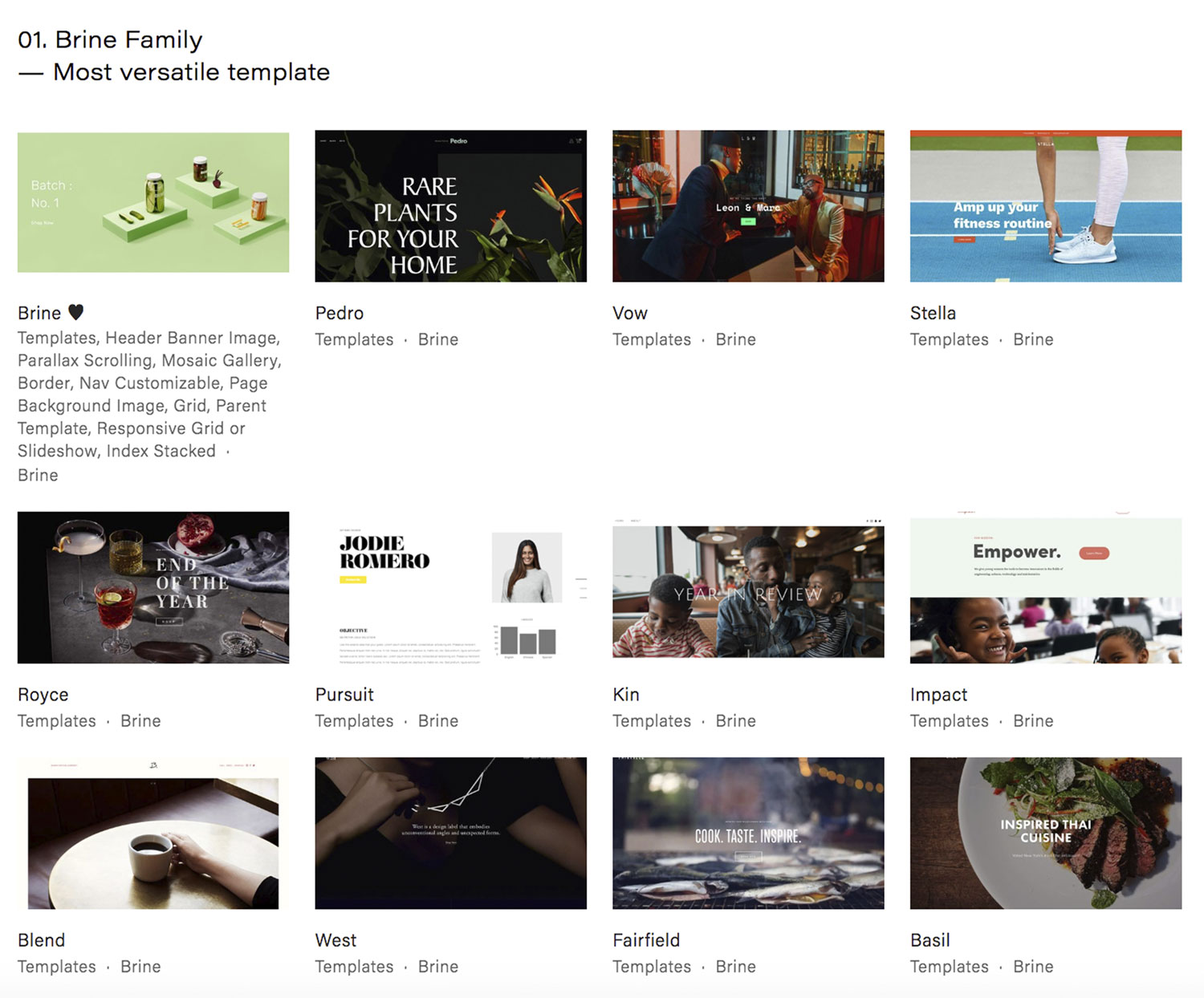
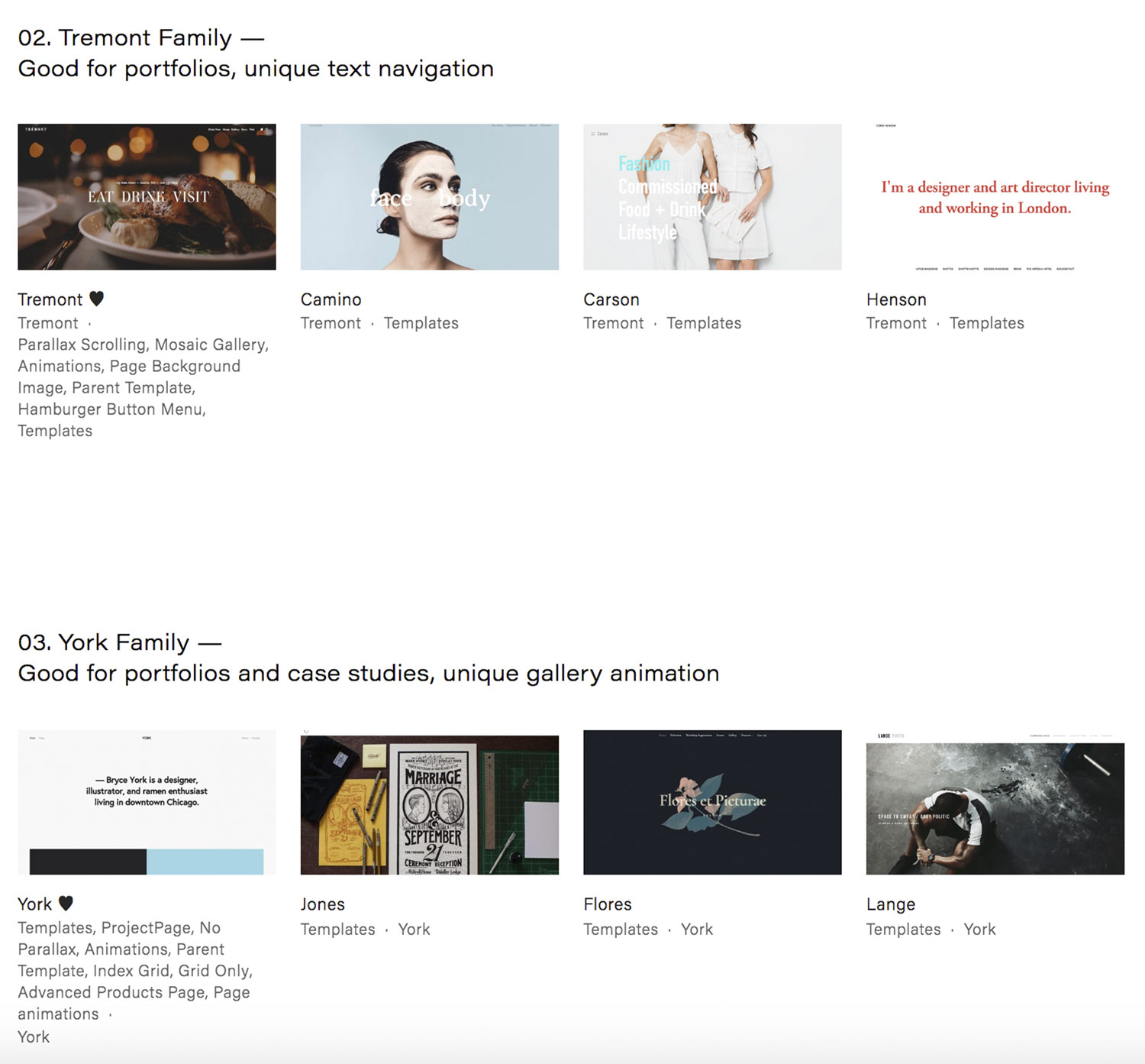
Alright, what are you looking at here? Essentially, I’ve bucketed each template into a Template Family. What is a template family? Let’s start with the Brine family. See all the templates below “01. Brine Family”? Every single one of these templates have the same exact features. GASP! I know, it’s nuts because they look so different.
I think this just shows the power in fonts, photos, colors, and layout. Plus, under each template are universal blocks that can really make your designs different.
I teach a Squarespace course where we going go through the tedious, but highly educational way of proving my point. Once you can convert one template into another template, you’ll really understand.
So, back to the question at hand, how do you pick a Squarespace template?
2. Prioritize your deal breaker features.
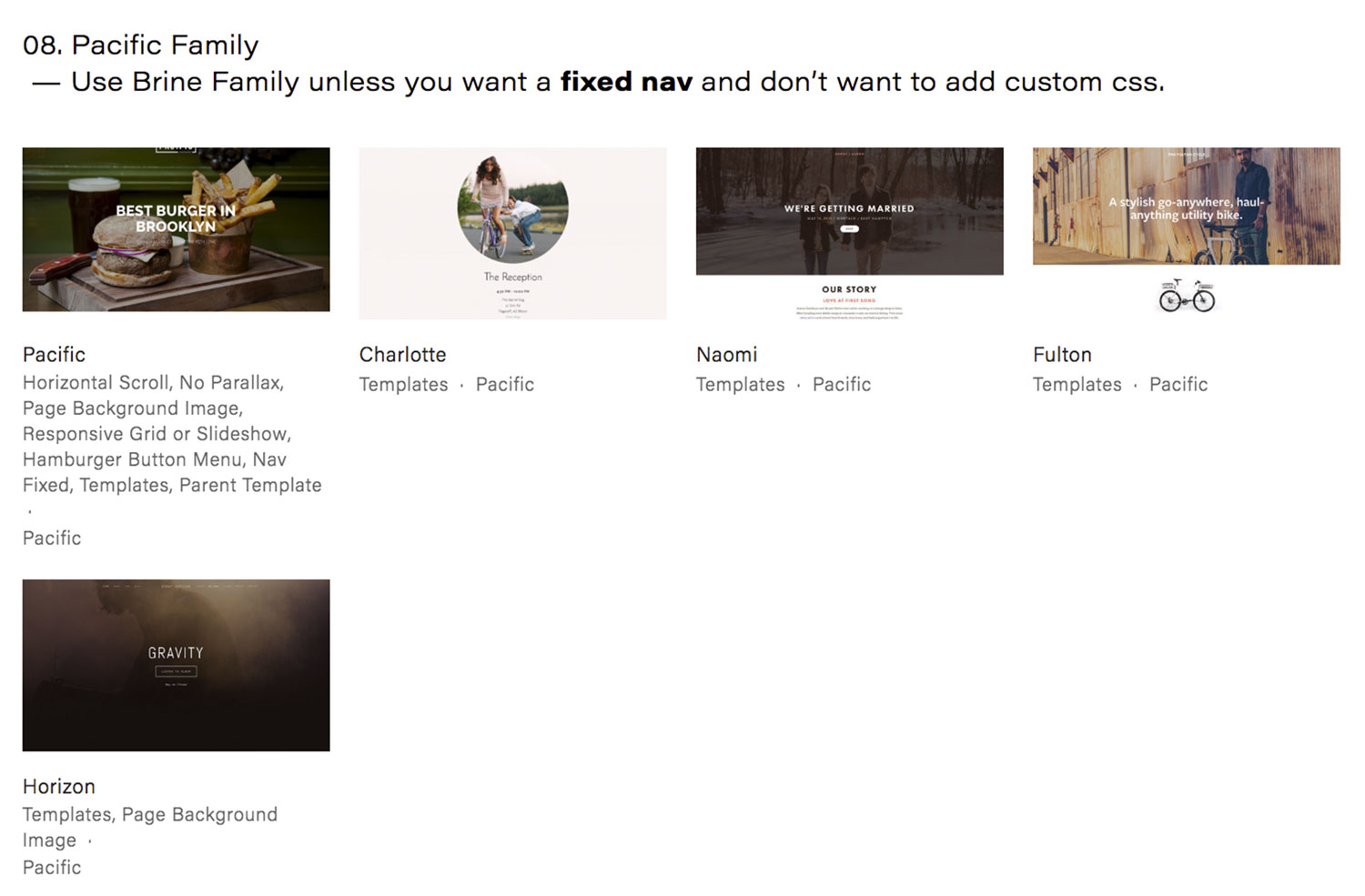
With this tool, you’ll see that you actually only have to choose from 9 templates. Not so overwhelming anymore, huh? If you ignore all the ones that say “Meh, use Brine”, then you’ll only be choosing from 5 templates! Personally, I think Squarespace is quadrupling down on the Brine family. As you can see in the Squarespace Comparison Tool, majority of the templates are in the Brine Family.
The way you choose between the five templates is you look for the deal breaker features you (or your client) really cares about. For example, parallax scrolling. This is a when you have two images layered on top of each other. As you scroll, there is an illusion of depth. You’ll want to make sure that the template you choose includes that feature. If you don’t have a deal breaker feature, then just stick with the Brine family! It’s the most versatile.
3. Select your template within the family (or just make it easy and pick the parent template).
Alright, but which template should you choose from within a Template Family? For me, I just pick the parent template (or whatever the name of the Template Family is). Before I begin designing, I’ll be deleting all of the demo pages and starting from scratch. Couple of other things to consider:
- You cannot combine templates
- You can switch templates without committing to one
- All templates are responsive (i.e. mobile friendly)
If you’re a freelancer taking on Squarespace clients, make sure you understand each template and their features. We do this in my course, but you can most definitely do this on your own as well.
If you’re an entrepreneur trying to make their own website, take a look at each of the Parent Templates (eg, the first thumbnail under each Template Family). And see which one you like! Ignore the other templates because you’ll be adding your own photos and fonts.
I’m a big fan of Squarespace and I definitely think you can make your site not look like a Squarespace site. Ilovecreatives.com was built on Squarespace and so was Shape Shift Report, By Toni, and J Hannah Journal. Now, I have to mention that these also have CSS, but I never had to use Developer Mode!